Maryland Today
Case Study – 2018-2019
- Company:
- Marketing and Communications, University of Maryland
- Role:
- UI/UX Web Designer
- Tools:
- Sketch, Drupal
- Shipped:
- 2018-2019
How Maryland Today was designed to serve readers and writers alike, balancing editorial UX, university brand guidelines, and 508 accessibility compliance.
While working for the Office of Marketing and Communications at the University of Maryland we set out to build a dedicated news platform from the ground up; one that could serve as the university's editorial voice and give the communications team a purpose-built home for their journalism. The project was brought to our team by the Director of Digital, and I was responsible for translating the direction into a finished visual and user experience design.
The Challenge
Building a news platform means designing for two very different audiences at the same time. Readers needed a clean, fast, and accessible experience that felt editorial and credible. Writers and editors needed a backend that didn't get in the way of doing their job.
The second part of that challenge is easy to overlook. Content management systems are notoriously difficult for non-technical users; nested fields, hidden tags, unintuitive layouts that bear no resemblance to the article being written. Our team advocated early for an editorial experience that matched the mental model of a writer, not the data model of a developer.
Constraints
The design operated within a defined set of constraints from the start. University of Maryland brand guidelines governed typography, color, and identity. The guidelines were maintained by our office for use across the entire institution. 508 accessibility compliance was non-negotiable, meaning every design decision had to hold up against federal accessibility standards for contrast, navigation, and screen reader compatibility.
The Design
My director provided the initial design direction and we developed wireframes and comps together, which were taken to the editorial team for feedback. From there the execution was mine. I worked on translating those early explorations into a fully realized front-end design.
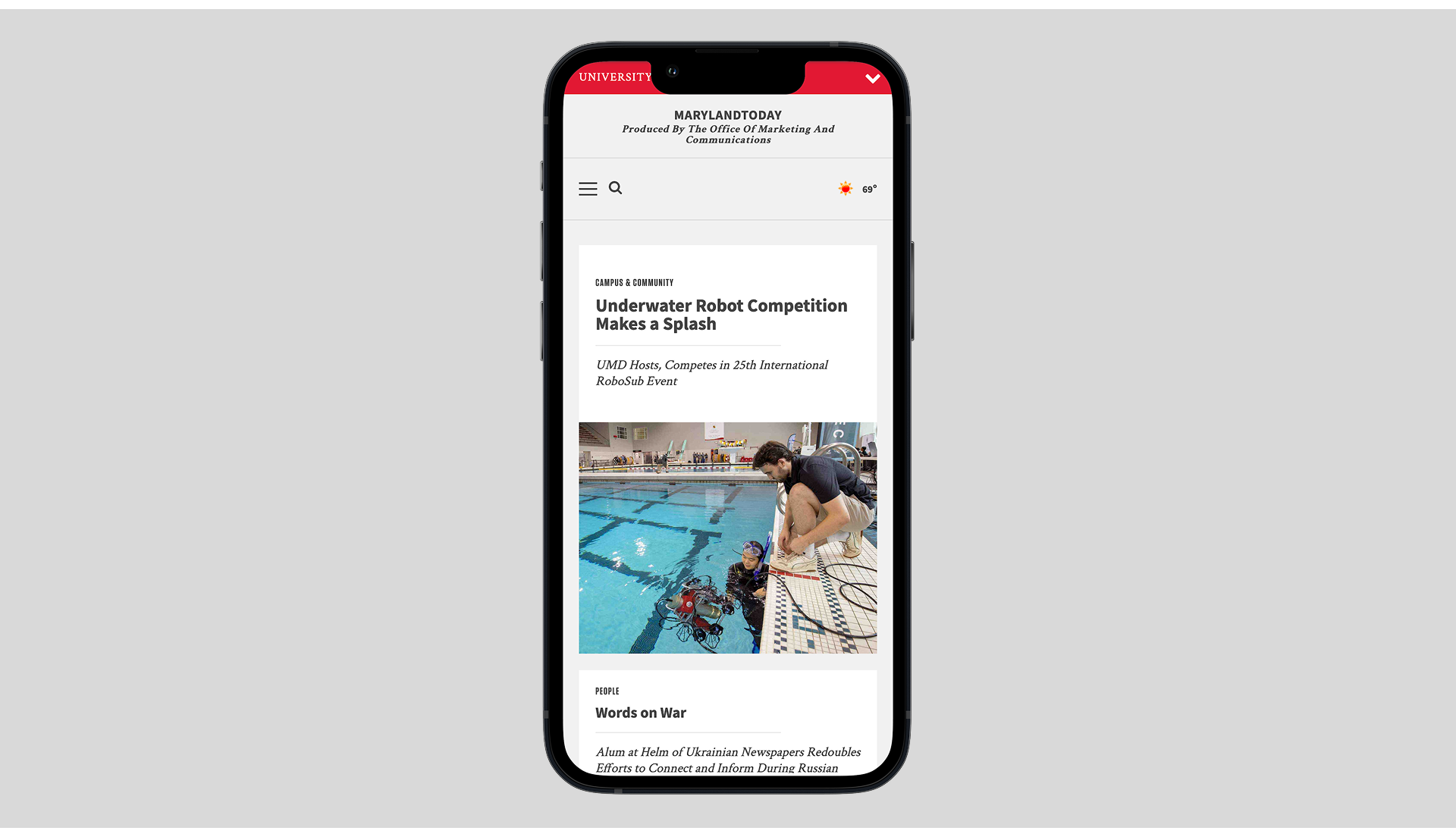
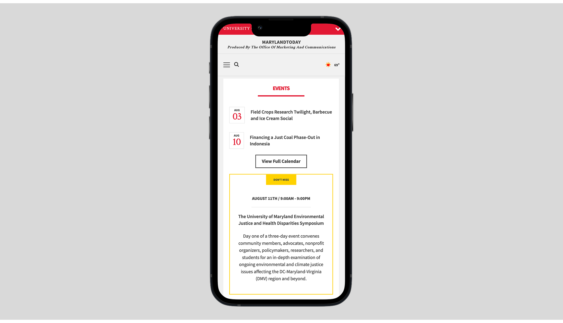
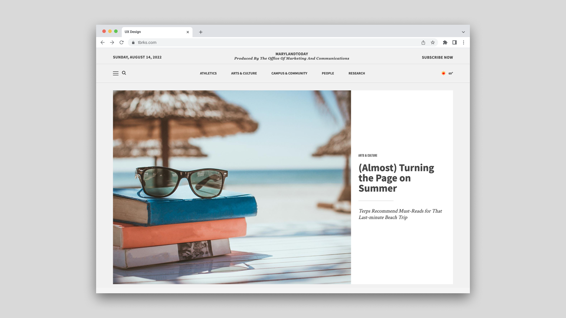
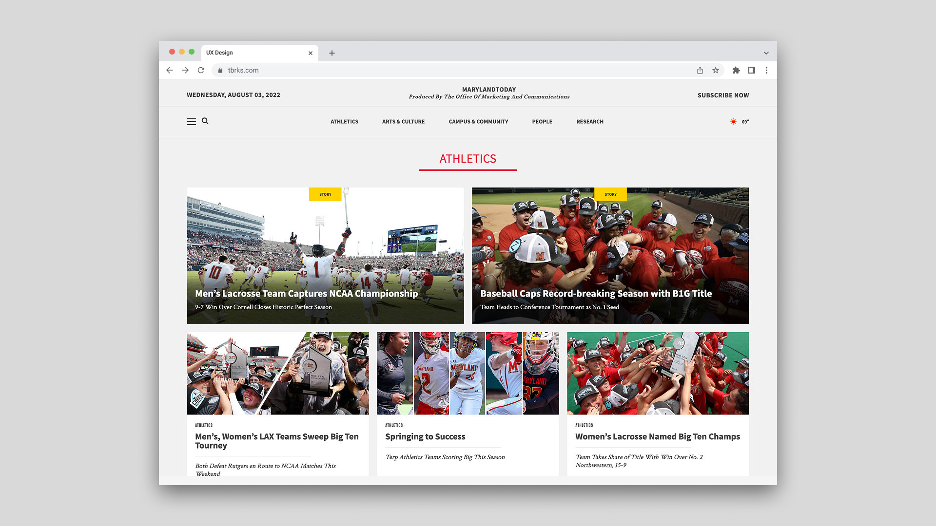
The visual direction leaned editorial and newspaper-inspired, with a clear content hierarchy that put strong imagery and headlines first. The layout was designed to scale across a high volume of stories across multiple categories. Which included Athletics, Arts and Culture, Campus and Community, People, and Research. Not a single section was built feeling like an afterthought.
On the backend, content fields were mapped directly to article templates so that what editors saw in the CMS reflected what readers would see on the page. The authoring workflow followed the natural structure of writing an article, headline, subheadline, body, imagery, rather than forcing writers to navigate a system built around database logic. No nested fields, no hidden tags, no guesswork.
My Role
I owned the visual design and UX from wireframe to finished product. I collaborated with a senior developer who handled the technical backend architecture, and contributed to the CMS content structure from a design and editorial usability perspective. The front-end build was a shared effort, with the heavier technical lift handled by the senior developer on the team.
Outcome
Maryland Today launched as a high-traffic decoupled Drupal platform built with ReactJS, SASS, and Bootstrap. The visual design has remained consistent since launch, a reflection of the care put into building something with enough structural integrity to last. The platform continues to serve as the University of Maryland's primary editorial news channel.
Reflection
Maryland Today was one of my earlier lessons in designing for the person behind the content, not just the person consuming it. The editorial workflow decisions we pushed for, logical field order, template-matched layouts, no unnecessary complexity, were not glamorous design problems. They did not show up in a visual comp. But they shaped how smoothly the platform functioned for the team using it every day, and that is as much a UX outcome as anything visible on the front end.
It also taught me how to work effectively within institutional constraints. Brand guidelines and accessibility standards can feel like restrictions, but designing within them well is its own skill, one that forces precision and builds the kind of trust that lets a team ship with confidence.