Brightlayer Home
Case Study – 2022-2024
- Company:
- Eaton Corporation
- Role:
- Senior UX Designer
- Tools:
- Figma, Miro, UserInterviews.com
- Shipped:
- 2022
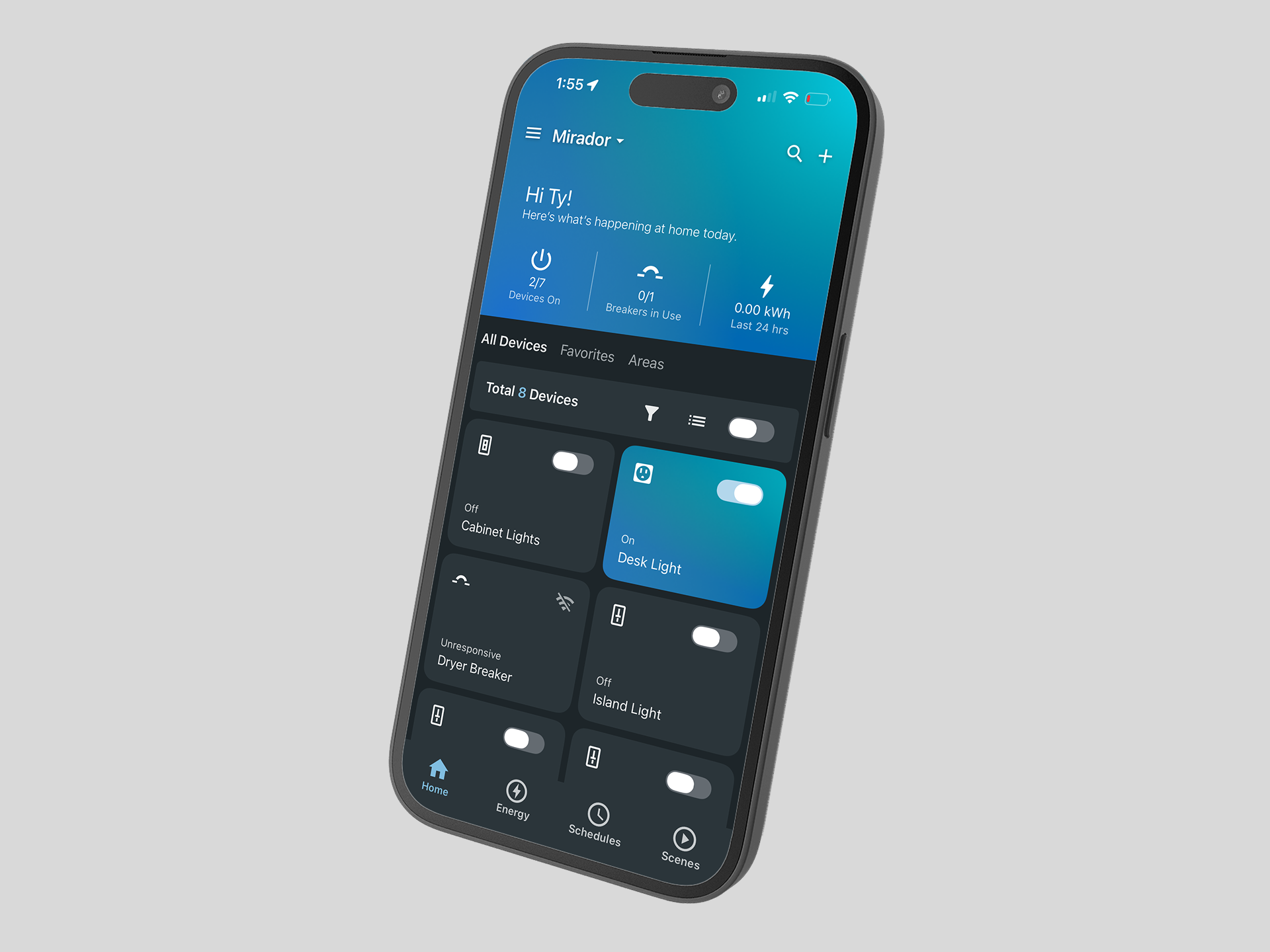
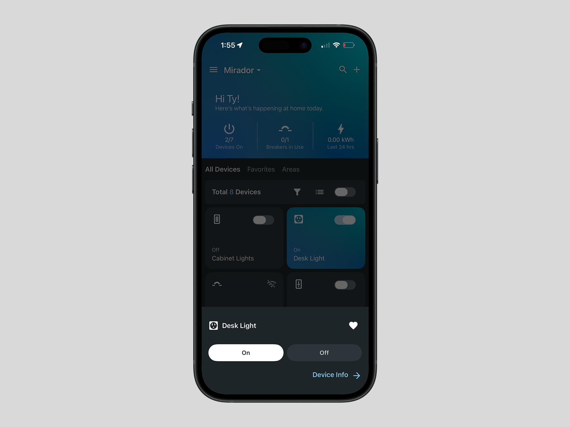
Brightlayer Home is a consumer smart home app for iOS and Android that lets homeowners monitor and control Eaton's smart breakers and wiring devices from a single interface. It gives users real-time energy visibility, remote device control, scheduling, and usage insights, designed for everyday homeowners who want smarter control over their home's energy without needing an electrician to interpret it.
At Eaton I served as the owner of the UI and UX experience for the app, acting as the bridge between the product team and development. I translated technical requirements into usable designs, then communicated those decisions back to developers through detailed Jira tickets and active participation in sprint planning - ensuring nothing got lost between design intent and what actually shipped.
Background
The Challenge
When I joined the team, Eaton had two separate apps serving two separate device types - one for smart wiring devices and one for smart breakers. Users who owned both types of hardware were forced to bounce between apps, creating a fragmented and frustrating experience that undercut the value of the ecosystem Eaton had built.
The goal was clear: merge the two apps into a single, unified experience that worked seamlessly across both device types. My job was to make that happen through end-to-end UX research, usability testing, and UI design - ensuring the consolidated app felt like it was built that way from the start, not stitched together from two separate products.
Research
Understanding the User
Before opening Figma, I needed to understand three things: who the users were, how the products worked technically, and how users actually thought about energy distribution throughout their homes. Those were not the same question, and answering all three was essential before making any design decisions.
I developed user personas to define the distinct audience segments we were designing for, then used those personas to identify and recruit interview candidates through UserInterviews.com. This gave us access to participants who matched our target profiles precisely rather than relying on convenience sampling. In parallel, I also interviewed existing users of the two apps being merged, giving us direct behavioral insight from people who already lived with the product's current limitations.
Sessions were recorded, synthesized in Miro, and organized into themes that shaped the product requirements and informed every major design decision that followed.
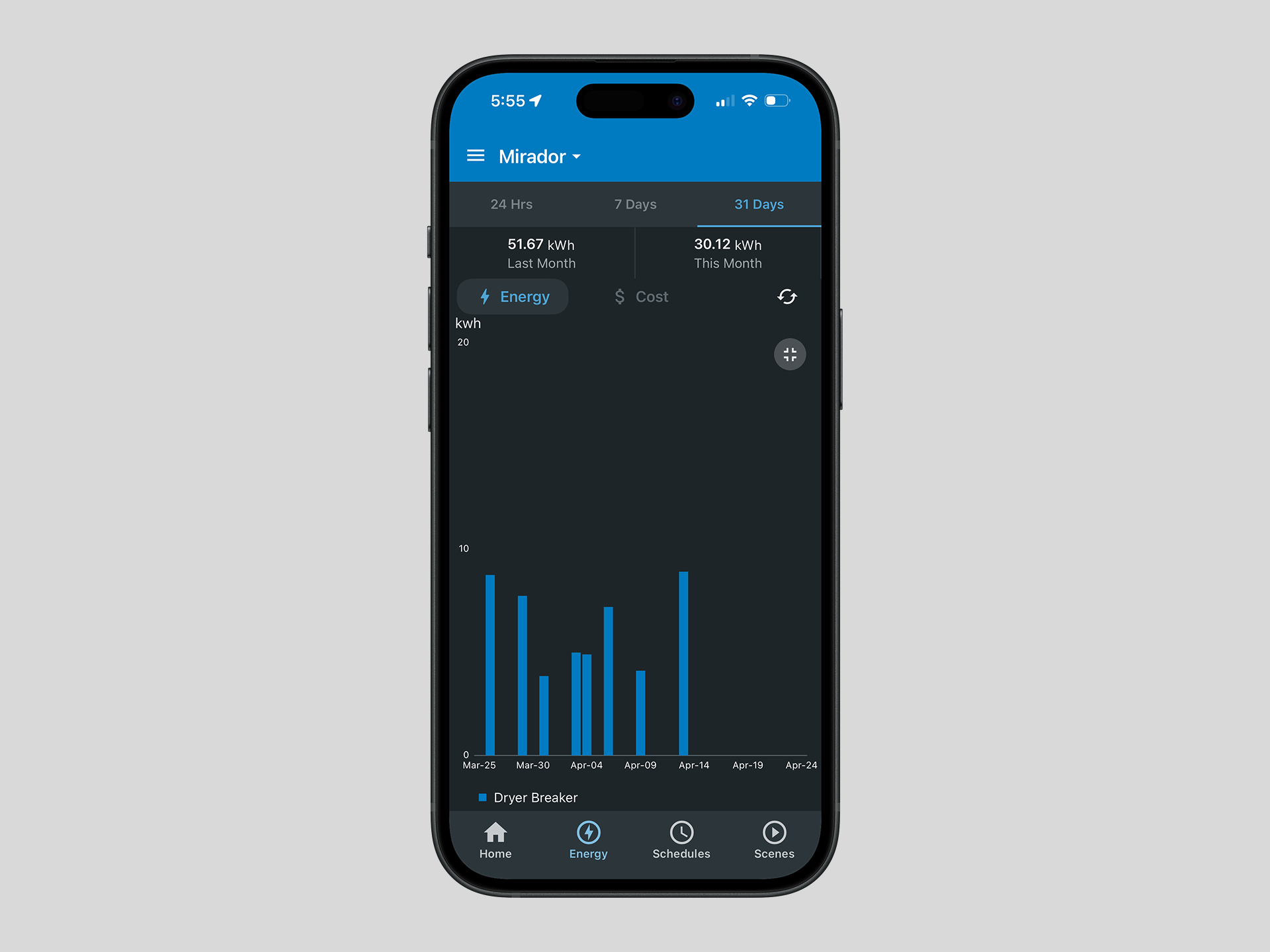
Energy Visibility
Users wanted to understand where their energy was going and how to make the most of it - not just a raw data feed, but a clear picture they could actually do something with.
Consolidated App View
Multi-device households were the norm - Most users had three or more smart devices and needed a unified view — not a device-by-device experience.
Onboarding
Users biggest concern was the onboarding and device setup experience. The message was clear - if that process felt seamless, everything else would follow.
Process
From Discovery to Delivery
With research insights in hand, I moved through a structured but iterative design process - returning to users at each major decision point rather than waiting until the end to validate.
Information Architecture & User Flows
Journey maps helped us visualize the full product structure and identify where users were running into friction. With actionable feedback from user research in hand, we were able to organize the app around patterns that reflected how users actually thought and behaved - not assumptions.
Low-Fidelity Wireframes & Concept Validation
Using Balsamiq for low-fidelity wireframes, we could move fast and test early. Once validated against user expectations, we translated them into Figma and progressed to the next phase confident the core flows were sound.
High-Fidelity Design & Interactive Prototyping
We built a complete application in Figma, including prototype functionality used for user testing. The designs were built on Eaton's Studio Blue Brightlayer UI framework, which is grounded in Material Design 3.
Usability Testing & Iteration
I was responsible for conducting moderated usability studies with 5–7 external users using the Figma prototype. After each round I worked through findings in Miro, affinity mapping, clustering themes and synthesising insights, then turned those into a summary report or presentation for stakeholders before moving to handoff. After final sign off from stakeholders and product owners the UI was updated and finalized.
Engineering Handoff & Sprint Collaboration
After final design I helped product owners author detailed Jira stories using Gherkin acceptance criteria for every feature, and stayed embedded through the development and sprint review process to ensure implementation matched the design intent and edge cases were handled correctly.
Outcome
Results
Brightlayer Home shipped to both the App Store and Google Play, achieving a 4.7 rating with over 2,100 user reviews - a strong signal of usability and user satisfaction in a competitive category. The design system and component library established for Brightlayer Home also served as the foundation for a second app, AbleEdge Installer, accelerating delivery across both concurrent products and ensuring a consistent experience across the Eaton ecosystem.
Reflection
What I Learned
Designing a consumer IoT app required me to pick up complex technical concepts quickly while simultaneously designing for very different types of users. The app needed to work for someone who wanted granular control over every device, and equally for someone who just wanted to set it up and forget it. Finding that balance was one of the more challenging aspects of the project - and one of the most rewarding.
Staying close to users throughout every phase - not just at the beginning - proved to be the most valuable part of the process. Making informed, research-backed decisions at each stage regardless of where we were in the timeline created a repeatable approach that I now bring to every project I work on.
A note on process: this page was built with the help of Claude and Claude Code. I actively use AI tools to move faster and focus my energy on the design decisions that matter most.